『爆弾低気圧』が来るか!?という中、TDC Tokyoセミナー開催決行。韓国からはアン・サンヨル氏が来日なさいました。
TDC Tokyo seminar was held at this weekend, when "bomb cyclone" may attack Tokyo, Mr. Ahn Sam Yeol came from South Korea for this occasion.
"폭탄 저기압"이 올지!? 이라고 하는 중, TDC Tokyo 세미나 개최 결행. 한국에서는 안삼열 씨가 방일 하셨습니다.
"폭탄 저기압"이 올지!? 이라고 하는 중, TDC Tokyo 세미나 개최 결행. 한국에서는 안삼열 씨가 방일 하셨습니다.

アン・サンヨル氏について詳しくはこちら。以下、セミナーの一部です。
Here is more info about Mr. Ann Sam Yeol . The belows are a part of his seminar.
안삼열 씨에 대해서는 여기 좀 봐즈세요. 이하, 세미나의 일부입니다.

「最初は自分の名刺用に『310』という数字について製作していたのですが、それからABCに移って、Bodoniとか日本の明朝体について研究しました」。
Here is more info about Mr. Ann Sam Yeol . The belows are a part of his seminar.
안삼열 씨에 대해서는 여기 좀 봐즈세요. 이하, 세미나의 일부입니다.

「最初は自分の名刺用に『310』という数字について製作していたのですが、それからABCに移って、Bodoniとか日本の明朝体について研究しました」。
"I've been worked a number 310 which is used for my own name card. And I've shifted to ABC and then Bodoni, Italian font, or Ming in Japan."
처음에는 자신의 명함용에 "310"이란 숫자에 대해서 제작하고 있는데, ABC에 옮겨지고, Bodoni라든가 일본의 명조체에 대해서 연구했습니다.
처음에는 자신의 명함용에 "310"이란 숫자에 대해서 제작하고 있는데, ABC에 옮겨지고, Bodoni라든가 일본의 명조체에 대해서 연구했습니다.

「『横線が細いハングルがなぜ無いのか?』という疑問の元に、『雑誌の多くは英語がタイトルになっている、そしてハングルがタイトルになれないのはなぜか?』という不満と喝! とともに作業しました」とのこと。
"Why there is no font which has a decent thin horizontal line with Korean font?" And why most of Korean magazines don't have Korean as titles at their artcles?" He had a sort of dissatisfaction toward to current existed Korean fonts and given Katsu!, which is pouring a split like "Move on!", while he's working on his font.
"가로줄이 자세한 한글이 왜 없냐고? "이란 의문랑, "잡지의 대부분은 영어가 타이틀이 되고 있다. 한글이 될 수 없는 것은 왜?" 란 불만과 "커듯!" (정말로 이대로 해도 좋은 거야? 라고 강하게 의문을 포기하는 것)생각란과 함께 작업했습니다.

1970年代、チェ・ジョンホ氏の作った明朝系が現在で一番多く使われている韓国語の明朝体だそうなのですが、それを踏まえて彼は「初めの筆の形と、終わりの筆の形が品があるように、そして丈夫に見えるように」作られたそうです。
Since 1970s, ming font which Mr. Choi Jeong-ho made are still popular in Korean today, but he has thought about its fact and then "I've paid my attentions to my font that its form at the first brush and the last form of a brush would have some class and stay steady."
1970년대 최정호 씨가 만든 명조체가 한국에서도 현재 가장 많이 사용되고 있는 한국어 명조체라고 인데, 그것을 포함시키셔 그는 "처음 붓 모양과 끝 붓 모양이 품위가 있토록, 그리고 튼튼하게 보이도록" 만들었대요.
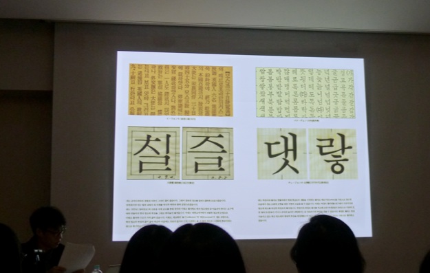
その他に、韓国語の書体は級数が大きくなると横の線が太くなるということ、現在ではSM3という明朝系が多く使われるらしいです。
It seems that most of present Korean font systems becomes fatter its horizontal lines when they are used in bigger typo and most popular font is SM3.
그리고 한국어의 서체는 커지면, 가로줄이 굵어진다라고 하는 것, 현재에서는 SM3이라고 하는 내일아침 계가 많이 사용되는,이라고 하는 것인 것 같습니다.
It seems that most of present Korean font systems becomes fatter its horizontal lines when they are used in bigger typo and most popular font is SM3.
그리고 한국어의 서체는 커지면, 가로줄이 굵어진다라고 하는 것, 현재에서는 SM3이라고 하는 내일아침 계가 많이 사용되는,이라고 하는 것인 것 같습니다.
いろいろ説明してくださりながら、[書体デザイナーでない]自分は感覚と直感に頼って作った自分は「実は書体の歴史については、このセミナーのために調べました(苦笑)」とのこと。
Though, he has checked out Korean font history for this seminar only.
여러가지 설명해 주셨는데 서체 디자이너 않음 자신은 감각과 직관을 만고, "사실은 서체의 역사는 이 세미나를 위해 조사했습니다 (쓴웃음)"라는 하셨어요 ㅋㅋ
여러가지 설명해 주셨는데 서체 디자이너 않음 자신은 감각과 직관을 만고, "사실은 서체의 역사는 이 세미나를 위해 조사했습니다 (쓴웃음)"라는 하셨어요 ㅋㅋ

「私はアナログ教育を最後に受けた世代です」。
"I am the last generation who has received an analog education as the very last."
"전 아날로그 교육을 최후에 받은 세대입니다".
"전 아날로그 교육을 최후에 받은 세대입니다".
彼が「この『花』という文字から香りが匂い立つようです」と言ったのが印象的でした。
It was interesting that he said "this letter, flower, seems to oozes out a scent of it.'
그가 "이 '꽃' 이란 문자로부터 향기가 나는 것 같습니다"라고 말한 것이 인상적이었습니다.

次はソウルでお目にかかります。よろしくお願いいたします。
See you in a Seoul very soon.
다음에 서울에서 뵙겠습니다^^